Ancilarry Texts


Final Music Video
Evaluation
Question 1 - In
what ways does your media product use, develop or challenge forms and
conventions of real media products?
For my music video, I chose the song ‘Song 2’ by the
English rock band ‘Blur’. Out of the different types of music videos that can
be created - performance, narrative, abstract and animated – I chose the
performance type, with a slight abstract quality. The performance aspect is
typical of rock music videos. My video, with the band performing in a small
room is especially uses conventions of punk videos, specifically the videos for
the songs ‘Sliver’ by ‘Nirvana’ and ‘Longview’ by ‘Green Day’. I developed this
generic type of video with some abstract features. Firstly, the band isn’t
always performing, but sometimes ‘fooling around’, examples being when the
drummer throws a bed cover over the guitarist, and when the singer has balloons
in his mouth. This represents the youth culture of this type of music, and creates
the light hearted tone I was aiming to create. The tone of the music video
appealing to teenagers, and is of lads having fun. Another example is the bands
friend walking in on them going crazy, and walking backwards, eventually
backing out of the house and down the street. This is also a humorous feature
of the video, and doesn’t make much sense, therefore being an abstract aspect
of the video. By making the video light-hearted in these ways I have used the
forms and conventions of real music videos. For example, the rock band ‘Foo
Fighters’ uses humour in many of their music videos, most significantly their
song ‘Learn to Fly’. I have utilised humour to reflect real music videos.
The type of song and genre of ‘Song 2’ allowed me to
create a music video according to its style which is loud and grungy.
Therefore, I used the conventions of rock, punk and grunge videos to create a
convincing music video, similar to that of a real media product. I found out
the codes and conventions of rock music videos by researching different types
of rock music videos and their codes and conventions. I created a PowerPoint,
detailing the features of the indie/alternative, metal and punk sub-genres of
rock. I also selected three existing music videos that are similar to the music
video of my chosen song. Through watching these videos and analysing their
codes and conventions, it helped me decide what the image and style of my music
video was going to be, and to give it its own identity so it can be easily
identified as a specific genre. From my researching, I have found out that
performance is the main form of rock music videos. We also watched some music
videos in the classroom and they were also mainly orientated around
performance. Therefore, the form I have taken on for my video is very conventional
and common in rock music, and also in other genres of music videos. Close ups of faces, group shots and shots of
instruments I have found are common conventions in rock music videos. I used
these features in my video.


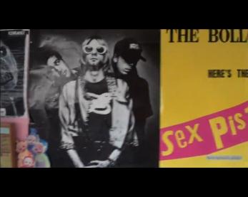

 The images above to the left are from my video, and the ones above to the right are from the ‘Three similar music videos’ post on my blog. These shots influenced mine and are common conventions of rock music videos. The Mise en scene is an important aspect of my music video. I have tried to reflect the genre and tone of the video in the setting by using the props and costumes. The room is a stereotypical teenager’s bedroom: untidy, posters and ornaments that a teen might have. I have tried to reflect the tone and theme of the video in the opening shot. The red bull cans in the foreground represent the energy expressed by the performers and the energy in the song. Also, the CD’s in the background represent music in general. The posters feature bands such as the‘Nirvana’ and ‘Sex Pistols’, which relate to the song in terms of grunge and punk rock. The poster with ‘Woo Hoo’written on it is a visual link with the lyrics, which is the Woo Hoo shouted in the chorus. The purpose of it is to show a visual link, reinforce the light-hearted tone of the video (there are also balloons that are thrown into the shot) and provide an intertextual link to Bob Dylan’s video for‘Subterranean Homesick Blues’. The costumes that the band wears are casual and look rock/indie. The denim and leather jacket worn by the guitarist and singer respectively are typical rock attire. The drummer is different because he wears a large coat, shades and a blank expression almost throughout. I didn’t want my music video to be generic or simply a performance video, so I added me walking backwards, the poster, balloons, and the band ‘fooling around’ to add an abstract and most importantly, fun side to the video. My main influence into doing this is the majority of ‘Foo Fighters’music videos. In these ways, my video does use and somewhat challenge the forms and conventions of real rock music videos.
Question 2 - How
effective is the combination of your main product and ancillary texts?
I have tried to keep a recurring theme among my main
product and the ancillary texts. I have also tried to keep a consistent house
style among the ancillary texts. I think they are effective because they
reflect the genre and look like real album sleeves and advertisement.


I wanted the main colours of both products to be black and
white, and blue, because I think those colours as a style blend really well and
don’t look out of sync with each other (as a whole, it doesn’t look too bright
or too dark).

I used the Posterize adjustment frequently on my
ancillary texts. I used it to create the cartoon like style on the black and
white face on the album sleeve and the front cover of the album. When it came
to producing the poster advertisement, I used the same effect on the band
members faces to keep a consistent effect throughout the ancillary texts. To
create the images on the digipak, I mostly took screenshots from the finished
music video and edited them on Photoshop onto the digipak. I also used an image
I took from my AS coursework of a gig at Lamp.
The images on the left are the original frames (plus one
image) and on the right are the edited versions that are on the final digipak.


This image is effective because it represents heaviness of the song, which can also represent the album as a whole as being heavy.


I think this is effective because it reflects volume and loudness, which relates to the song (although I should’ve edited the image when the volume was a 10. Furthermore, the round volume nob would match the round CD.


Because this genre of music has an urban style/image, an urban location is fitting for the album sleeves.


The borders and guitarist looked to me like a real album cover, mainly influenced by the ‘Nirvana’ album ‘Bleach’, which is in my planning.

 The guitarist on the back cover keeps a consistent theme,
and the space on the right is suitable for the track listing. However, I have
been told that the images on the front and back covers are too similar, which I
now agree with.
The guitarist on the back cover keeps a consistent theme,
and the space on the right is suitable for the track listing. However, I have
been told that the images on the front and back covers are too similar, which I
now agree with.

A stage light refers to live gigs, which is a common image associated with rock music.
The band name ‘The Fuse’ looks simple and effective on the advertisement. I thought of ‘The Fuse’ because short, snappy four letter words in band names (like Muse, The Cure, Pulp and Blur) are easy to remember and look good on a poster. ‘The Fuse’ in my opinion is a great name for a rock band because of these reasons, and the fact that the word ‘Fuse’ sounds like a bomb going off or heat, which connotes that the band is hot, or an explosion of good music and popularity. Although the poster uses the conventions of the other posters I researched in my planning, and features all the information on it required to the audience, I now think that it would have supported the urban image of the band and the music video if I had a transparent brick wall behind the blackness in the background. The brick wall would give it a more urban feel. I featured singles from the album onto the poster as a marketing strategy to the audience. It is common and important that albums adverts mention its hit singles if it has any, and actually say the word ‘hit’ because it appeals to the audience. The digipak is in the style of a rock album and is effective in conveying the genre and urban theme, and the poster does the music justice in keeping a similar theme visually, and telling the audience what they need to know about it i.e. when it comes out, what the cover looks like and its hit singles. I wanted my advertisement to be simple, contain the information about the album that the audience needs, and look consistent with the digipak. Likewise I wanted the digipak to look consistent with the advertisement, and reflect the genre of music as well as use conventions of rock album art.
Question 3 - What have you learned from your audience feedback?
From the feedback
I received in the form of questionnaires about my music video, I found out that
the quality and camera shots I used where the preferred elements of the video.
I tried to use a variety of camera of camera shots, and to an exceptional
quality. The two criticisms were aimed at one of the shots and the performance
of the drummer. Matt who played as the drummer has no sense of rhythm, and so
during filming it was difficult for him to get the timing right in sync with
the songs beat. Clearly, I can tell from the audience feedback that this issue
showed in the final cut. The shot that I was told ‘goes on for too long’ is at
01:25 to 01:30 (below). The shot pans across but


Question 4 - How
did you use new media technologies in the construction and research, planning
and evaluation stages?
Blogger was the first thing I used at the start of the
project. Blogger is a feature of Google where you can store text, images,
videos etc. onto a list called a blog. I created a blog and named it harleyyounga2media,
and used it to store all of my planning and final product pieces. Blogger is
really useful in keeping my work in an easy to access and organised place.
However it can be awkward and frustrating at times when posting writing and
images together onto a new post because it can be difficult to arrange the
images exactly where I want in relation to the text. In my initial stages of
research, I used the uploading and streaming website YouTube to watch music
videos, to research different types of and the codes and conventions of music
videos. I created an account called HAYMEDIA17, and on this account I uploaded
my draft and final edit video. YouTube is an easy access area where my audience
can watch my music video at any time. My audience also accessed it on YouTube
to fill in my audience feedback questionnaires.
After I decided I wanted to produce a rock music video, I
researched the codes and conventions of rock music videos, detailing the common
features of a few of rocks sub-genres. I presented this research on Microsoft
PowerPoint (below).


These are the slides in the PowerPoint. I really like
using PowerPoint because the slides can be presented in a very simple way, but
contain the information needed. The last three slides have a description of the
sub-genre, an image to illustrate and text to illustrate the image. This is
more interesting than simply a paragraph on a word document describing what the
sub-genre is. I created a storyboard with around 20-25 sheets of paper and
uploaded them onto blogger by using a scanner to scan the sheets, save them as
images and post them onto my blog. Although scanning is a simple process, I
found it time consuming because I had to scan and save each separate sheet of
paper. This is mainly why I chose not to create a Prezi to present the storyboards
on my blog. However, I now know that would have been a more productive way of
presenting them instead of just listing them on my blog, which is what I have
done. Although Microsoft Word is the simplest form of document to present work,
I could still use it in different ways to present different types of
information. Firstly, I could write in text and paragraphs, I could write in
bullet points to briefly and quickly illustrate points, which I used in my
shooting plan, and I created a table on Word also to present my ‘Music Video
Risk Assessment’. Additionally, when I created a story board for 30 seconds to
a minute of ‘Sliver’ by ‘Nirvana’, I copied images from frames of the music
video and illustrated them with text. To create my music video I used Adobe
Premier Pro CS6 on the editing suit computer. I used this to upload all of my
footage which I could then watch back, upload onto the editing software and
compile each of the clips into a video. When it came to uploading the shots
onto the software, I named the shots and numbered them so I could easily
identify which shot I needed to use. I did this after watching through all of
the shots I had filmed first, and deleting the ones I didn’t need. This was the
first time I had used this software so I had to adjust because I had never
edited a whole video myself before. Fortunately, I was using it at the same
time for my film for Film Studies, so I had more time to practise and use the
software. I used various effects and methods of editing my video of Adobe
Premier. I trimmed the raw footage down to the time frames that I had
identified in my storyboards and compiled them together in sync with the vocals
and instrumentation. I used the transitions fade in/out and wipe. Additionally,
at the start of the video I used a background soundtrack of ambient street
noises. I did not know how to acquire an effect such as this, so I consulted
the media/film editing suit supervisor Ray to find me an ambient street noises
sound sample from his computer. Using the software simultaneously for both
subjects helped me get used to it quickly. To record the footage I needed, I
used a Sony HD digital camera. With it being a digital camera, I could upload
each clip (when I stopped and started recording) separately, which made it easy
to watch through them all and delete the ones I did not need. I preferred to
use this because it is easy to operate and the quality of film it records is of
a high standard.
 For my ancillary texts, I only took one photo. I used an
OLYMPUS SP-600 UZ still camera to take this photo. The resolution of the image
is very fine, but unfortunately I couldn’t use this to take an image of all of
the band members, so I improvised and took a screenshot within the final video
of Matts face, and used a photo of Adam that another media student had taken of
him. Rest of the images I used in my ancillary texts are all screenshots from the
video, because the video contained all the appropriate imagery I needed for the
digipak. I used Adobe Photoshop to create my advertisement and digipak.
Photoshop was easy and it didn’t take long at all to produce the texts because
I had used Photoshop extensively in the past for other Media/Film projects. The
layout of the digipak was supplied to us via an Adobe Acrobat Document. I
transferred the document onto Photoshop, and created and edited the images onto
the dimensions of the digipak layout. By already having experience with
Photoshop, I could comfortably include any effect I wanted.
For my ancillary texts, I only took one photo. I used an
OLYMPUS SP-600 UZ still camera to take this photo. The resolution of the image
is very fine, but unfortunately I couldn’t use this to take an image of all of
the band members, so I improvised and took a screenshot within the final video
of Matts face, and used a photo of Adam that another media student had taken of
him. Rest of the images I used in my ancillary texts are all screenshots from the
video, because the video contained all the appropriate imagery I needed for the
digipak. I used Adobe Photoshop to create my advertisement and digipak.
Photoshop was easy and it didn’t take long at all to produce the texts because
I had used Photoshop extensively in the past for other Media/Film projects. The
layout of the digipak was supplied to us via an Adobe Acrobat Document. I
transferred the document onto Photoshop, and created and edited the images onto
the dimensions of the digipak layout. By already having experience with
Photoshop, I could comfortably include any effect I wanted.
Overall, I think I created a quality and conventionally
sound music video, with ancillary texts that support them stylistically. The
music video matches the genre of music well, which I tried to do. I am pleased
with the audience feedback, and acknowledge that I could’ve changed some
aspects of the film and planning to make it more thorough and professional. I
encountered some problems with Blogger and filming, but not enough to hinder my
final products. If I were to do this project again I would definitely spend
more time identifying my audience and getting feedback from a range of different
types of people, and I would use a more diverse range of software to present my
planning i.e. Prezi, Go Animate.
.


